Detailed Page List
View a detailed list of all available page types separated by Office or School
Shared Page Properties
Every page has some basic fields which are always available. Some are located at the top of the pages while others are within the labeled tabs. These properties are accessed through the “All-Properties” view.

Office Pages
District Office Directory Page
The District Office Directory is an index page for the District Office Detail pages. The Office Directory is structured using the District Office Detail pages information. The directory is managed in collaboration with the information office editors enter on their District Office Detail pages. This page is managed by Web Services. Email any questions to websupport@pgcps.org
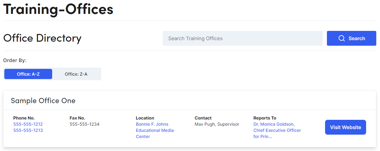
District Office Detail
The District Office Detail pages spotlight individual offices across the district. This page has a hero banner, a section to fill in the details about the office (location, hours, phone numbers, etc.) and a flexible content area to allow each office to present information to their viewers as needed.

Properties
|
Properties |
Description |
|
Page Title |
Enter Text. Will display as header (h1) on the page. If left blank, the page name will be used. Note: Understanding Page Defaults |
|
Banner |
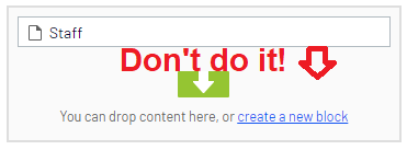
Drag & Drop Hero Banner Block (1) Note: You should only create new Blocks in your “Blocks” folder. DO NOT create blocks in properties that allow the ability to create them (see image.)
|
|
Hide Hero Block |
Hide Banner. Note: The District Office Directory page has the ability to show a banner image across all District Office Detail pages. Select this property to hide/show the banner |
|
Blocks |
Drag & Drop Blocks. Use the Display Options to adjust layout. Note: Contact Blocks 1st contact displays as the main contact on the District Office Directory page. Blocks allowed: Accordion, Background Container, Contact, Featured Image, Link Card, Rich Text, Tab, and Video blocks. Adhering to our Naming Convention when creating new Blocks is critical to maintaining a healthy system. |
|
Info Tab: Properties |
Description |
|
Location Name |
Enter Text |
|
Location Link |
Drag & Drop Pages from the Office Building Directory. Navigation Pane Location: PGCPS Home>Shared Resources>Office Building Directory>Find page needed. |
|
Address Line (1, 2, 3) |
Enter Text |
|
Description |
Enter Text |
|
Phone Number (1 & 2) |
Enter Phone Number |
|
Fax |
Enter Fax Number |
|
Hours |
Enter Text |
|
Division |
Drag & Drop Pages from the Office Directory. Navigation Pane Location: PGCPS Home>Offices>Find page needed. |
|
Reports To |
Drag & Drop Pages from the Office Directory. Navigation Pane Location: PGCPS Home>Offices>Find page needed. |
Landing Page
The Landing Page has a full width view with versatile layout options and is recommended if an increased visual presence is needed.
Properties
|
Properties |
Description |
|
Page Title |
Enter Text. Will display as header (h1) on the page. If left blank, the page name will be used. Note: Understanding Page Defaults |
|
Content |
Drag & Drop Blocks. Use the Display Options to adjust layout. Blocks allowed: Accordion, Background Container, Contact, Featured Image, Link Card, Link Card Collection, Rich Text, Tab, and Video blocks. Adhering to our Naming Convention when creating new Blocks is critical to maintaining a healthy system. Note: You should only create new Blocks in your “Blocks” folder. DO NOT create blocks in properties that allow the ability to create them (see image.)
|
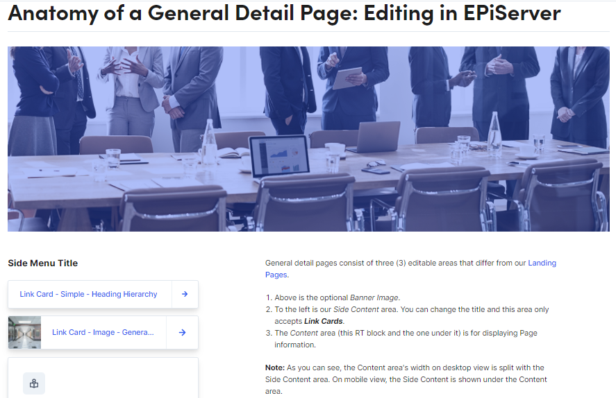
General Detail Page
The General Detail Page can be used as an informational page with related content elements in the left column.
Properties
|
Properties |
Description |
|
Title |
Enter Text. Will display as header (h1) on the page. If left blank, the page name will be used. Note: Understanding Page Defaults |
|
Hide Gradient Overlay |
Removes blue tint from banner image |
|
Banner Image |
Drag & Drop Hero Banner Image (1) |
|
Content |
Drag & Drop Blocks. Use the Display Options to adjust layout. Blocks allowed: Accordion, Background Container, Contact, Featured Image, Link Card, Link Card Collection, Rich Text, Tab, and Video blocks. Adhering to our Naming Convention when creating new Blocks is critical to maintaining a healthy system. Note: You should only create new Blocks in your “Blocks” folder. DO NOT create blocks in properties that allow the ability to create them (see image.)
|
|
Side Content Title |
Enter Text. Will display as header (h2) on the page. |
|
Side Content |
Only accepts Link Card Blocks. See: Link Cards
|
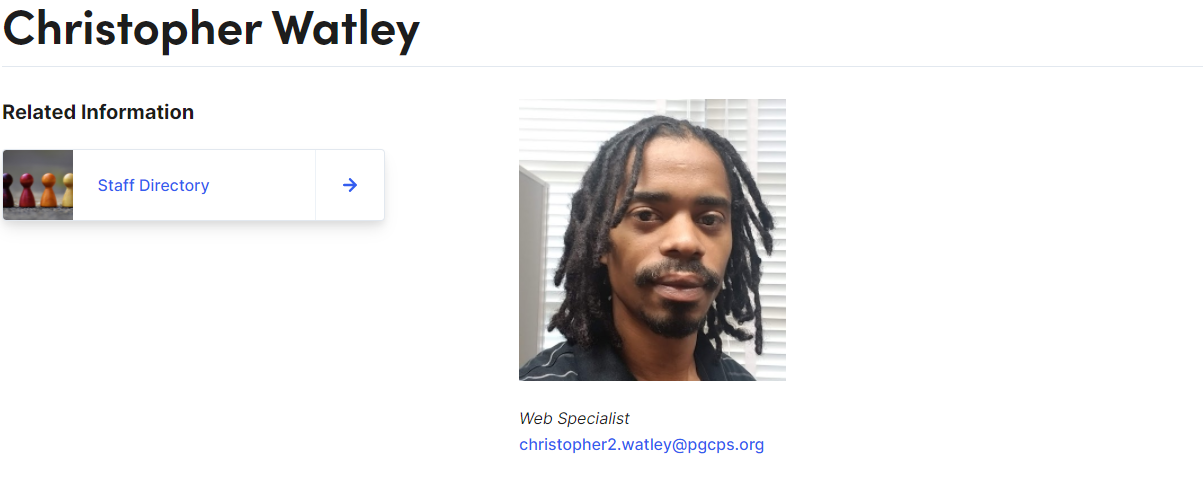
Person Detail Page
The Person Detail page is used to profile district board members and or district level staff. This is the only Page Type to display different properties when used as a Partial Page View (card.) There are two steps needed to create the full experience, (1) Create the Person Detail Page, (2) Create a RT block to display more details about the featured person.
Partial Page View: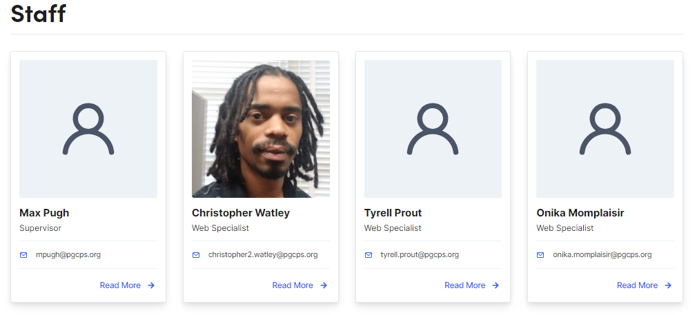
Page View w/ Side Content:
Properties
|
Properties |
Description |
|
Title |
Enter Text. Will display as header (h1) on the page. If left blank, the page name will be used. Note: Understanding Page Defaults |
|
Hide Gradient Overlay |
Removes blue tint from banner image |
|
Banner Image |
Drag & Drop Hero Banner Image (1) |
|
Content |
Drag & Drop Blocks. Use the Display Options to adjust layout. Blocks allowed: Accordion, Background Container, Contact, Link Card, Link Card Collection, Rich Text, Tab, and Video blocks. Adhering to our Naming Convention when creating new Blocks is critical to maintaining a healthy system. Note: You should only create new Blocks in your “Blocks” folder. DO NOT create blocks in properties that allow the ability to create them (see image.) For Person Detail Pages it is suggested to use a RT block and keep the display of information simple.
|
|
Side Content Title |
Enter Text |
|
Side Content |
Only accepts Link Card Blocks. See: Link Cards
|
|
Details: Properties |
Description |
|
Image |
Drag & Drop Image. Note: Recommended Size 267px by 267px |
|
Person Name |
Enter First and Last name |
|
Position/Role |
Enter Text |
|
|
Enter Email address |
|
Phone |
Enter Phone Number |
|
Subscribe Link |
Enter URL link |
School Pages
School Container Page
The School Container Page organizes schools into types: High School, Special Centers, Public Charter, Academy, Elementary, etc. This page is used for broadcasting content to specific sections within the School Home Page: Spotlight, Carousel, and Announcements sections. Web Services manages this page.
Training Example (Opens to the Experience Editor in a new browser tab)
School Home Page
The Homepage contains the school specific settings for the page content, header, footer, and other key school-wide settings.
Content Tab
|
Properties |
Description |
|
Category |
This category is inherited from the parent container page. |
|
Title |
Enter text. |
|
Top Card Links |
Add Link Card Block only. Drag & Drop Link Card Blocks. Use the Display Options to adjust layout. See: Link Cards. Adhering to our Naming Convention when creating new Blocks is critical to maintaining a healthy system. |
|
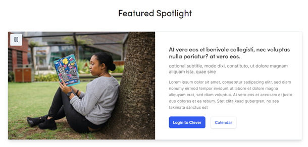
Featured Spotlight |
|
|
Properties |
Description |
| Spotlight Carousel Title |
Enter text. |
|
Feature Spotlight |
Click the plus icon to add a new feature. |
|
Feature Image |
Click inside the box to add an image. |
|
Title |
Enter text. |
|
Subtitle |
Enter text. |
|
Body |
Enter text. |
|
Primary/Secondary Button Link |
Click the ellipsis icon to select a page. |
|
Primary/Secondary Button Target |
Select a link target. |
|
Primary/Secondary Button Text |
Enter text. |
|
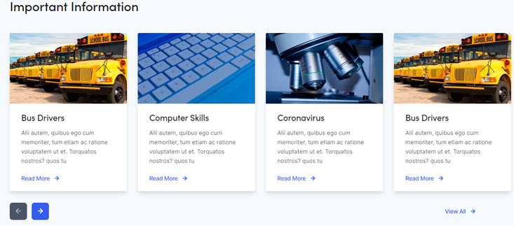
Card Carousel |
|
|
Properties |
Description |
|
Section Title |
Enter text. |
|
Cards |
Content Card:
|
|
View All Link |
|
|
Text |
Enter text. |
|
Link |
Click the ellipsis icon or drag in a page from the page tree structure in the left pane. |
|
Link Target |
Select a link target. |
|
Announcements |
|
|
Properties |
Description |
|
Section Title |
Enter text. |
|
Announcements |
Content Card:
Maximum of 3 Content Cards. |
|
View All Link |
Click the ellipsis icon or drag in a page from the page tree structure in the left pane. |
|
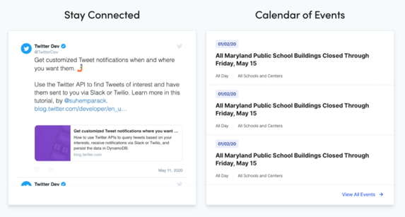
News & Events |
|
|
Properties |
Description |
|
Social Media Section Title |
Enter text. |
|
Social Media Embed Code |
Use this text area to add embed code from social media. Example: <a class="twitter-timeline" data-width="500" data-height="500" data-theme="light" href="https://twitter.com/TGESTIGERS?ref_src=twsrc%5Etfw">Tweets by TGESTIGERS</a> <script async src="https://platform.twitter.com/widgets.js" charset="utf-8"></script> The social media information does not display on mobile. |
|
View All Events Link |
Click the ellipsis icon or drag in a page from the page tree structure in the left pane. |
|
Calendar Section Title |
Enter text. |
|
Calendar Link |
Click the “+” icon to add a link to Google Calendar. Example: https://calendar.google.com/calendar/embed?src=2u43qko5dausa07b12mfl82lg2sgag4u%40import.calendar.google.com&ctz=America%2FNew_York |
|
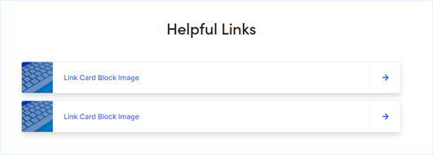
Helpful Links |
|
|
Properties |
Description |
|
Helpful Links Section Title |
Enter text. |
|
Helpful Links |
Add Link Card Blocks only. Drag & Drop Link Card Blocks. Use the Display Options to adjust layout. See: Link Cards. Adhering to our Naming Convention when creating new Blocks is critical to maintaining a healthy system. |
|
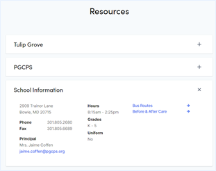
Resources |
|
|
Properties |
Description |
|
Resources |
Only an Accordion Item Block can be added to this section. Items appear above School Information. Drag & Drop Accordion Item Blocks. See: Accordion Items. Adhering to our Naming Convention when creating new Blocks is critical to maintaining a healthy system. |
|
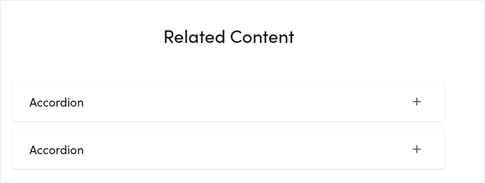
Related Content |
|
|
Properties |
Description |
|
Related Content |
Only an Accordion Item Block can be added to this section. Drag & Drop Accordion Item Blocks. See: Accordion Items. Adhering to our Naming Convention when creating new Blocks is critical to maintaining a healthy system. |

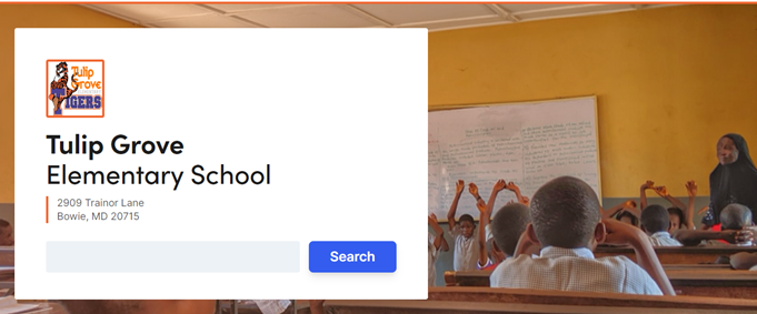
Hero Banner Tab
The Hero Banner is used to feature the school with a full width image, address, and search option.
|
Properties |
Description |
|
Hide Gradient Overlay |
Checkbox to toggle gradient overlay on and off |
|
Hero Image |
Drag-and-drop from the media assets pan. |
|
Image Alt Text |
Enter text. (For screen readers/508 Compliance) |
|
Hero Video |
Drag-and-drop video files from the media assets pan.
|
|
Hero Video Description |
Enter text. (For screen readers) |
|
Gradient Overlay Opacity |
Change the opacity on the gradient color displaying over the hero image |
|
Logo |
Drag-and-drop from the media assets pane. |
|
Note: School name and address displayed in the Hero is from the Info Tab: Name Line 1, Name Line 2, Address 1 and Address 2. |
|
Header Tab

|
Properties |
Description |
|
Logo |
Click in the box or drag an image from the media asset panel into the box. Logo should not include text. Recommended size: 252 x 139 Note: If no logo is added, District Logo will be used |
|
Menu Links |
Drag in a page from the page tree structure in the left pane. Note: Menu dropdown links are pulled in from the top-level page's children. Top-level pages without child pages act as a regular link with no arrow. |
|
Border Color |
Enter RGB. Example: rgb(72, 187, 120) |
Note: If no information is entered, the County (PGCPS Home) footer is inherited.
|
Properties |
Description |
|
Footer Logo |
Click to select an image or drag image from Media. |
|
Contact Column Label |
Enter text to display above the contact column. |
|
Social Media |
Click the “+” to add Social Media links. |
|
Social Media Type |
Select a social media platform from the dropdown. Select the social media site and the corresponding icon will be pulled in: Facebook, Twitter, LinkedIn, Photo Gallery, or YouTube. |
|
Social Media Link |
Click the ellipsis to add a URL. |
|
Target |
Select a target for the link to open. |
|
Column 1 – 3 Label |
Enter text for the column header. Limited to 20 characters. |
|
Column 1 – 3 Links |
Click “create a new link” or drag in a page. |
Search Configuration Tab
The School’s search functionality only surfaces the School’s homepage and the School’s child pages. Content editors can use this area to drag in asset folders to include or exclude in the search.
|
Properties |
Description |
|
Search Pane |
Click the ellipsis icon or drag in the school search page. |
|
Asset Roots |
Use this to define searchable School assets (images, files…). |
|
Asset Exclusion Roots |
Use this to exclude School assets from search. |
|
Page Exclusion Roots |
Use this to exclude specific School pages from search. |
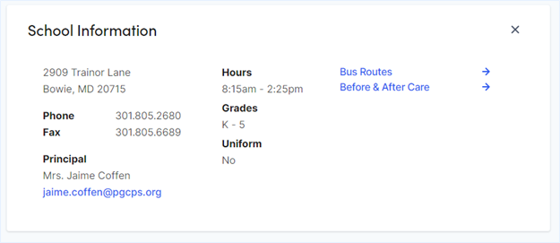
Info Tab
Some information entered here is used in other areas of the School site including header and footer. Also, much of this information appears on the School Homepage under in the Resource accordion:
|
Properties |
Description |
|
Name Line 1 |
Enter text. |
|
Name Line 2 |
Enter text. |
|
Address 1 Line 1 |
Enter text. |
|
Address 1 Line 2 |
Enter text. |
|
Address 2 Line 1 |
Enter text. |
|
Address 2 Line 2 |
Enter text. |
|
Phone Number 1 |
Enter phone number. |
|
Phone Number 2 |
Enter phone number. |
|
Fax Number |
Enter number. |
|
Contact Email |
Enter email. |
|
Principal 1 Title |
Enter text. |
|
Principal 1 Name |
Enter text. |
|
Principal Email 1 |
Enter email. |
|
Principal 2 Title |
Enter text. |
|
Principal 2 Name |
Enter text. |
|
Principal Email 2 |
Enter email. |
|
Hours |
Enter text. |
|
Grades |
Enter text. |
|
Uniform |
Enter text. |
|
Colors |
Enter text. |
|
Mascot |
Enter text. |
|
School Link |
Click the ellipsis icon or drag in a page from the page |
|
Image |
Drag-and-drop from the media assets pane |
Support Tab
|
Properties |
Description |
|
Questions and Concerns Text |
Enter text. |
|
Questions and Concerns Link |
Click the ellipsis icon or drag in a page from the page tree structure in the left pane. |
|
Area Number Text |
Enter text. |
|
Area Number Link |
Click the ellipsis icon or drag in a page from the page tree structure in the left pane. |
|
Area Resolution Services Text |
Enter text. |
|
Area Resolution Services Link |
Click the ellipsis icon or drag in a page from the page tree structure in the left pane. |
|
Parent Engagement Assistant Name |
Enter text. |
|
Instructional Director Name |
Enter text. |
|
Instructional Director Phone Number |
Enter number. |
|
Pupil Personnel Worker Name 1 |
Enter text. |
|
Pupil Personnel Worker Email 1 |
Enter email. |
|
Pupil Personnel Worker Name 2 |
Enter text. |
|
Pupil Personnel Worker Email 2 |
Enter email. |
|
Board District Text |
Enter text. |
|
Board District Website Link |
Click the ellipsis icon or drag in a page from the page tree structure in the left pane. |
Services Tab
|
Properties |
Description |
| How to Enroll text 1 |
Enter text. |
|
How to Enroll Link 1 |
Click the ellipsis icon or drag in a page from the page tree structure in the left pane. |
|
How to Enroll text 2 |
Enter text. |
|
How to Enroll Link 2 |
Click the ellipsis icon or drag in a page from the page tree structure in the left pane. |
|
Bus Routes Text |
Enter text. |
|
Bus Routes Link |
Click the ellipsis icon or drag in a page from the page tree structure in the left pane. |
|
Transportation Text |
Enter text. |
|
Before & After Care Text |
Enter text. |
|
Before & After Care Link |
Click the ellipsis icon or drag in a page from the page tree structure in the left pane. |
School General Detail Page
The School General Detail Page is a good utility or informational pages that can be utilized within the site structure.

Properties
|
Properties |
Description |
|
Category |
This category is inherited from the parent container page. (administrative property) |
|
Title |
Enter text. Will display as header (h1) on the page. If left blank, the page name will be used. |
|
Banner Image |
Drag-and-drop from the media assets pane or click inside the box to add an image. |
|
Content |
Blocks Allowable blocks:
Content Cards Allowable pages:
Note:
|
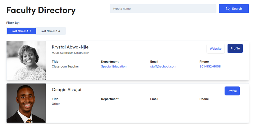
School Factory Directory
The School Faculty Page is an index of School Faculty Detail pages. It is used to feature faculty members and showcase their profile in a Content Card. The page is searchable by first and last name and is sortable by last name.
Properties
|
Properties |
Description |
|
Page Title |
Enter text here. |
|
Search Bar text |
Enter text here. |
|
Default Image |
Click inside the box or drag an image from the asset panel. |
|
Title |
Enter text here. |
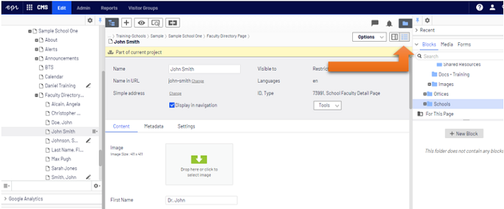
School Faculty Detail Page
The School Faculty Page sets up faculty members profile information for use as a Content Card or a child page of a School Faculty Directory page. Some, but not all properties listed, will be rendered on the Content Card and others are used on the Detail page. The Detail page features information about the faculty and an About section to spotlight specific details.

Training Example
Properties
|
Properties |
Description |
|
Image |
Drag-and-drop from the media assets pane or click inside the box to add an image. |
|
First Name |
Enter text. |
|
Last Name |
Enter text. |
|
Additional Name |
Enter text. |
|
Position |
Enter text. |
|
Room |
Enter text. |
|
Building |
Enter text. |
|
Department 1-2 Name |
Enter text. |
|
Department 1-2 Link |
Add a link to the department if wanted. |
|
Courses |
Enter text. |
|
Grade |
Enter text. |
|
Team |
Enter text. |
|
Class Website |
Click the ellipsis icon or drag in a page from the page tree structure in the left pane. |
|
Bio |
Enter text. |
|
Quote |
Enter text. |
|
|
Enter email. |
|
Phone Number |
Enter phone number. |
|
About |
Drag & Drop Blocks. Use the Display Options to adjust layout. Blocks allowed: Accordion, Background Container, Link Card and Rich Text. Adhering to our Naming Convention when creating new Blocks is critical to maintaining a healthy system. Note: You should only create new Blocks in your “Blocks” folder. DO NOT create blocks in properties that allow the ability to create them (see image.) |
How To Video
You should be in All Properties View to follow along with this video. The view buttons are in the upper right corner of the central editing area. The All Properties View button looks like a bulleted list.
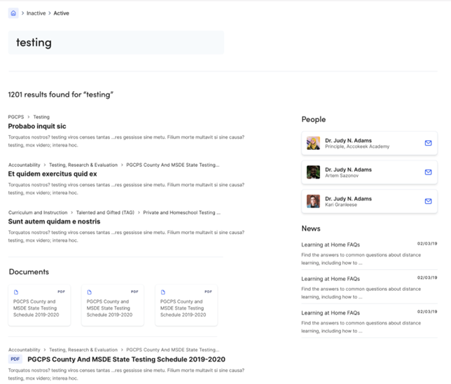
School Search Page
School Search Page is used to display search results based on the site visitor's search keyword. The School Search page limits the site visitor to content relevant to the school.
Properties
|
Content Tab |
|
|
Properties |
Description |
|
Title |
Enter text. Will display as header (h1) on the page. If left blank, the page name will be used. |
|
Search Configuration |
|
|
Properties |
Description |
|
Initial Page Size |
Enter number. |
|
“Load More” Page Size |
Enter number. |
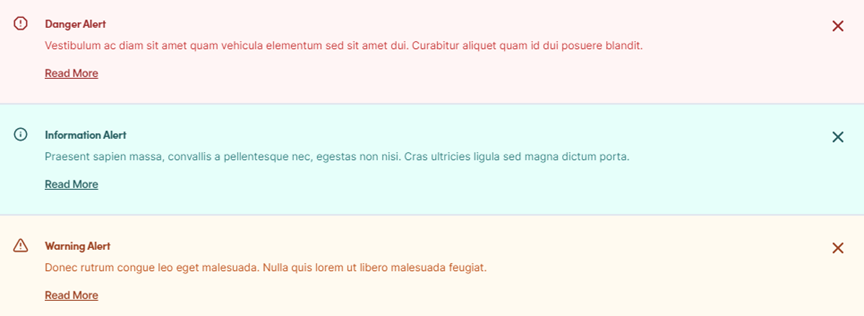
School Site Alert
Each school includes an Alert page. School Site Alerts can be scheduled to display on its parent School Homepage.
Properties
|
Content Tab |
|
|
Properties |
Description |
|
Alert Type |
Select Info, Warning or Danger. See above image for style. |
|
Heading |
Enter text. |
|
Summary |
Enter text. |
|
Body |
Enter Rich Text. |
| To schedule or render site alerts, use the Display Settings tab. | |
|
Display Settings Tab |
|
|
Properties |
Description |
|
Enable |
Check to enable. |
|
Start |
Enter or select a date. |
|
End |
Enter or select a date. |