Jump to Blocks
Editor Playground
Optimizely training area for PGCPS content editors.
Read More
A card! A Partial Page View (PPV) is a clickable card-like navigation tool that takes users to a page.
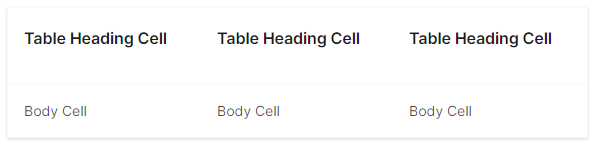
|
Block Type |
Where They Are Available |
Suggested Naming |
|
Accordion Container Block |
A - Name of content (i.e. A - Student Handbook) |
|
|
Child Page List Block |
Landing Page |
CPL - Name of content (i.e. CPL - Announcements) |
|
Pages |
LC - Simple - Name of Content LC - Exp - Name of Content LC - Img - Name of Content LC - Icon - Name of Content (i.e. LC - Simple - Immunizations) |
|
|
Landing Page |
FI - Name of Content (i.e. FI - Student Services Intro) |
|
|
Landing Page |
H - Name of page (i.e. H - General Counsel) |
|
|
Landing Page |
RT - Name of page or section (i.e. RT - Food and Nutrition) |
|
|
Pages |
CB - Name of Contact Group (i.e. CB - Contact Web Services) |
|
|
Pages |
VB - Name of Video (i.e. VB - School Graduation) |
|
|
Pages |
TCB - Name of Tab (i.e. TCB - School Story Cover) |
Accordion item has two states, open or closed. Click title or +/x to toggle open or closed.
Closed: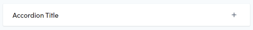
Open: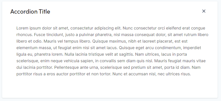
|
Property |
Description |
|
Category |
Not used for this block. Selecting a category does not impact this block. |
|
Accordion Title |
Enter text. Will be formatted as h3. Title will display if open or closed. |
|
Url Suffix |
|
|
Description |
Enter rich formatted text. See Rich Text for formatting options Will display when the accordion is open. |
|
Display Accordion Open |
Check to enable. If checked, the accordion will display open when the page is loaded. If unchecked, the accordion will display closed when the page is loaded. |
The Link Card block has four different variants. The card is a link.
Simple:
Image: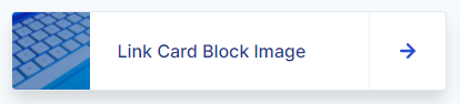
Expanded: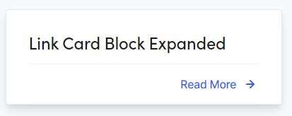
Icon: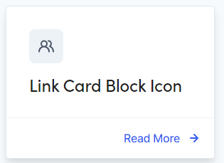
|
Property |
Description |
|
Card Type |
Select Simple, Image, Expanded, or Icon |
|
Text |
Enter text. |
|
Link |
Click the ellipsis icon or drag in a page from the page tree structure in the left pane. |
|
Link Target |
Select a target for the link to open. Options: Same Window, New Window |
|
Image (used for Image Card Type only) |
Drag-and-drop from the media assets pane or click inside the box to add an image. Recommended size: 325 x 174 |
|
Icon (used for Icon Card Type only) |
Select from Book Reader, Briefcase, School Bus, Graduation Cap, University or Users Alt. |
The featured image block allows the content editor to feature an image on either the left or the right side along with a rich text area on the opposite side.
|
Property |
Description |
|
Category |
Not used for this block. Selecting a category does not impact this block. |
|
Image |
Drag-and-drop from the media assets pane or click inside the box to add an image. Select Left or Right. Recommended size: 521 x 674 |
|
Image Alignment |
Select an option from the dropdown Options: Left, Right Default = Left |
|
Title |
Enter text. |
|
Date |
Enter a date. |
|
Subtitle |
Enter a subtitle. |
|
Description |
Enter a description. |
The Hero Banner block can display an image or text in a horizontal orientation on a page.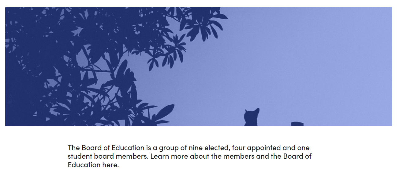
|
Property |
Description |
|
Hero Image
|
Drag-and-drop from the media assets pane or click inside the box to add an image. Recommended size: 1300 x 400 |
|
Hide Gradient Overlay |
Removes the blue tint from the image |
|
Hero Img Alt |
Text used for audience that use screen readers (508 compliance) |
|
Mobile Image |
Drag-and-drop from the media assets pane or click inside the box to add an image. Recommended size: 499 x 335 |
|
Description |
Enter text. This text displays below the image |
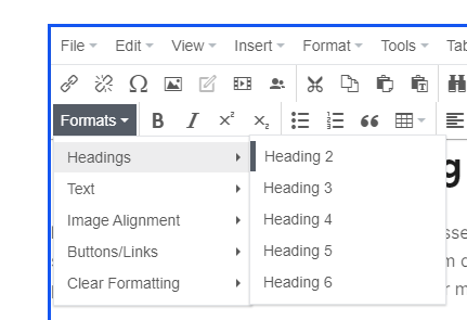
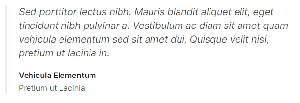
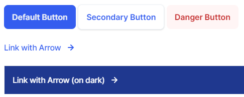
A rich text field for displaying formatted content. This block can change background colors to use white, grey, or blue as well as changing text color to provide appropriate contrast.
Much of your content entry will be rich text (text accompanied by styles, formatting, tables, images, etc.). The text editor has tools like your favorite word processor (e.g., Microsoft Word).
|
Property |
Description |
|
Background Color |
Choose between None (Transparent) White, Grey and Blue |
|
Heading styles
|
Best practices:
|
|
Image
|
Applying styles:
|
|
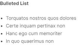
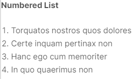
Lists |
|
|
Quote |
|
|
Buttons & Links |
|
|
Small text |
|
|
Table |
|
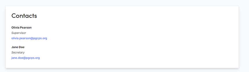
The contact block highlights contact information. This is a property list with a section header. Populate as many rows on the property list to create multiple contacts in one block.
|
Property |
Description |
|
Section Title |
Enter Text. Will be formatted as h2. |
|
Name |
Enter First and Last Name |
|
Title |
Enter Text |
|
|
Enter an email address |
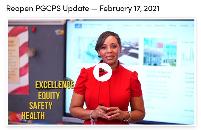
The Video block can use a YouTube link or a loaded video from the asset panel. The Title, thumbnail image and description can be overridden by the content editor.
|
Property |
Description |
|
YouTube Link |
Enter a YouTube link |
|
Video File |
Enter a video file |
|
Title Override |
Enter Text. Will be formatted as h2. |
|
Image Override |
Click or drag an image into the box |
|
Description Override |
Enter Rich Text |
The Tab Child Block has two states, closed or open. Click the title to toggle open or closed.
Open:
Closed: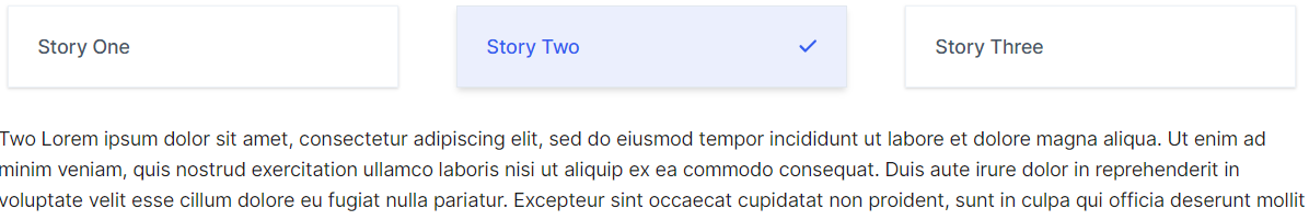
|
Property |
Description |
|
Title |
Enter Text. Will be formatted as h2. |
|
Url Suffix |
|
|
Open By Default |
Choose to display as open. Note: the top item in the Tab Block with the open property set gets precedence. |
|
Content |
Enter Rich Text |
Containers are block types created to group together specific block or pages types.
|
Container type |
Where they are available |
Suggested Naming Convention |
|
Pages |
A - Name of section (i.e. A - Important Information) |
|
|
Landing Page |
BC - Name of section (i.e. A - Useful Resources) |
|
|
Landing Page |
TB - Name of section (i.e. TB - Weekly Newsletters) |
|
|
Pages |
CPL - Name of section (i.e. CPL - Announcements) |
|
|
Pages |
FDB - Name of section (i.e. FDB - Parent Forms) |
The Accordion block holds an unlimited number of Accordion Item blocks.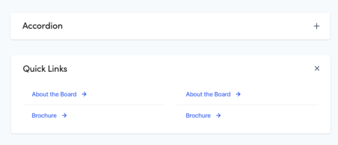
|
Property |
Description |
|
Category |
Not used for this block. Selecting a category does not impact this block. |
|
Accordions |
To create a new block: In your Blocks folder create a new Accordion Item Block. To add an existing block, drag-and-drop a block from the blocks assets pane. Allowable blocks:
|
Note: Background Containers should only be used to display as full width.
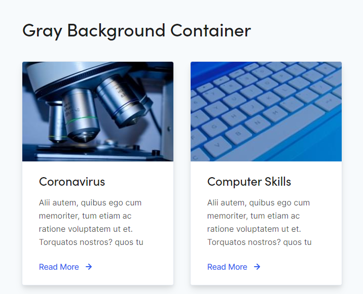
|
Property |
Description |
|
Headline |
Enter text. Will be formatted as h2. |
|
Headline Alignment |
Check this box to center align the title. |
|
Background Color |
Check this box to apply a gray background. |
|
Url Suffix |
|
|
Background Image |
|
|
Content |
Blocks
Content Cards
|
The Tab block holds an unlimited number of Tab Child blocks. You can choose to orient the tabs vertically or horizontally.
Horizontal: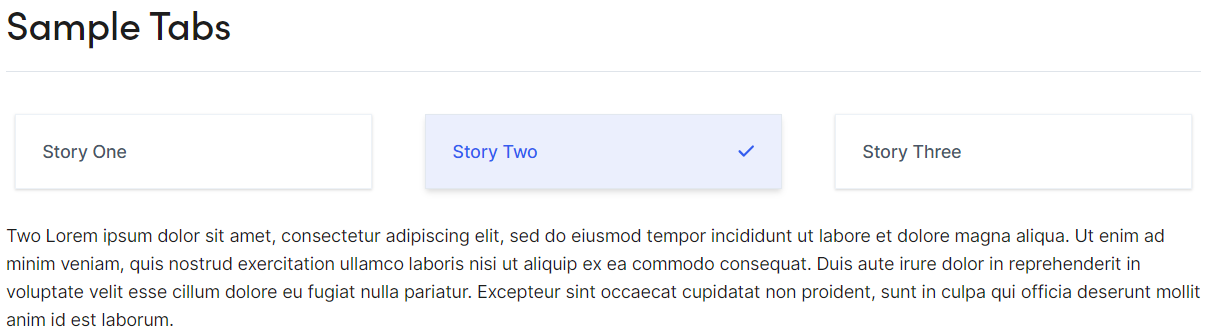
Vertical:
|
Property |
Description |
|
Title |
Enter Text. Will be formatted as h2. |
|
Orientation |
Select between vertical or horizontal |
|
Tabs |
To create a new block: In your Blocks folder create a new Tab Child Block. To add an existing block, drag-and-drop a block from the blocks assets pane. Allowable blocks: |
Note: Child Page List Blocks should only be used to display as full width.
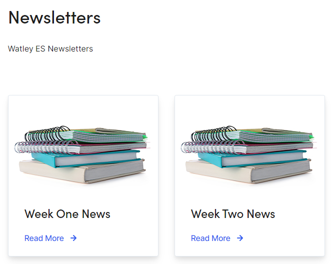
|
Property |
Description |
|
Parent Pages |
Drag and drop the parent page(s) that contain the child pages you want previewed. |
|
Block Title |
Enter text. Will be formatted as h2. |
|
Anchor Name |
|
|
Block Intro |
Enter text for a description of the block/pages being previewed. |
|
Number of Items to Display on Load |
Enter the number of page previews to be displayed. (Recommended: 100) |
|
Order By |
Sorting options for the order of the page previews
|
|
List Style |
Size options for the page previews (Recommended 1/4 or 1/3)
|
Note: Child Page List Blocks should only be used to display as full width.
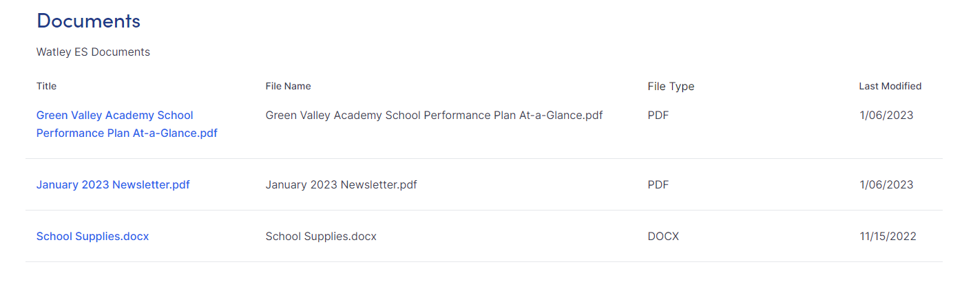
|
Property |
Description |
|
Heading |
Enter text. Will be formatted as h2. |
|
Description |
Enter text for a description of the files being shown. |
|
Folders |
Drag and drop the media folder(s) that contain the files you want shown. |